The Surly Process
G.o.T Season 8...... T-Shirts Are Coming!!
So this is it. After 7 seasons of crazy action, plot twists, gruesome deaths, partnerships, and double crossing, we get 6 episodes to put a bow on this thing. If you have made it this far you are going crazy each week waiting for the new episode to see who dies and who moves closer to the Iron Throne. With a limited 6 episodes we expect each one to delivery action, tie up loose ends, and kill main characters. I only see it fitting that I do a shirt an episode to mark the best, funniest, wildest, or most shocking moment(s) of each week. Can I crank out a shirt an episode??? Maybe......
Episode 1: Winterfellki

First off after this long ass layoff I wanted a main character to die in the first 5 minutes. Like let's get it poppin!!!! Alas they gave us a setup/reunion episode. All the people that fell out or had not seen each other in a while or needed to meet had their time to talk and exchange distrustful sassy stares. To me, this shit was boring. But fine, waste an episode setting the table, I get it. So what were the moments I had to choose from to make a shirt? As I saw it there were only really two moments that were shirt worthy.
Sam tells Jon he is not a bastard and that he is actually rightful heir to the throne. Or, Bran waiting on an old friend, and boom Jaime walks in. While Bran sitting there for what seem to be hours just anticipating Pushy Lannister to waltz his raggedy ass on into Winterfell was perhaps my favorite moment it wasn't the biggest. Jon finding out his true birthright won the day, which then he had to think, damn it, that mean's I'm related to her. After doing the family tree thing you realize that's Jon's aunt and well this was the first thing to pop into my mind (pic of shirt). For those of you who were under a rock this is a quote from Black Panther. Erik Killmonger showing up to drop a turd in the Wakandan Vibranium Punch bowl and letting everyone know he's family, Heeey Auntie, and has a right to challenge for the throne. Throne rights, aunties, it all fit too well.
Episode 2: A Knight of the Seven Kingdoms

Ok so we have the table set. We waited a week. We needed more. The second episode was better than the first in my opinion. Still no real action, but I don't know, things were more interesting and some loose ends got tied up. A lot of stuff to choose from here. It's 2am as I type this so bare with me hopping all over the episode, but there were several shirt worthy moments.
Arya gets busy with Gendry. I'll be honest, I still see her as a little kid so this was kinda creepy to me. However I guess she is old enough and she wasn't going to fight the white walkers and possibly die a virgin so yeah she got it in. I like how she punked him right before though, oh you been keeping count, how many times you swing that hammer big boy don't lie. Ned is rolling over in the crypt at his baby girl getting it on in the castle.
Jaime and Bran squash the beef. Damn all that, you push me out a window I'm in the court snitchin like Big Head Rico from Belly. Eating a banana , perm on fleek:

Peep how Jaime was like aight we good for now, but er um, you ain't gonna tell after the war right??
Brienne gets knighted. Awwwww wasn't that sweet. She stood up for Jaime, then he was all open and vulnerable with her like man I can't fight but I'll follow your command, then he knights her. A night moment for the two of them.
However none of that was as good as my guy Tormund turning up. From "Is the Big Woman Still Here" to his 40 oz horn of ale, to his pitching woo to Brianne, right on down to the story of how he got his name. I killed a giant then suckled his wife's breast for 3 months. What happened at the end of month 3 though?? That's a long time to be missing, like didn't his parent's wonder where their son was?? Westeros Child Protective Services ain't shit. I don't care what no one says this was Tormund's episode.
Episode 3: The Long Night

Wooooooooooo Ok so there is really nothing to say other than : ARYA MF'n STARK!!! so the funny thing is a few days before the episode I read some where that she regrets playing the character left handed because she is not left handed but in the books Arya was. But boy, when she needed to go right she did didn't she. So this one was a no brainer, she has been kicking ass and taking names, or taking names and kicking ass for a long time. It's been all over the 7 kingdoms. The only question that remains is will she get another tour date in King's Landing perhaps??

I happened to catch Avengers End Game this weekend also and well, Arya was better so she gets two shirts. I love you 3000 Arya.

Cue up the slow singing and flowering bringing for my man Night King one time. I just wanna know how you blow a lead like that. Arya was like the Cubs coming back from 3-1. I honestly thought this cat was going to do more damage I'm disappointed in Tyrone.
Episode 4: The Last of the Starks

Sansa just like her mama and gonna do what she wanna do !!! Ain't keep that secret but a hot minute. Anyway, while everyone at Winterfell was celebrating , drinking, having sex, proposing right before they rode south we forgot what was waiting on them. The new power couple in Westeros!!! That's right and apparently they were ready. Shooting down Dragons. Choppin heads. Next week, guaranteed to be a mess.

Bonus Tee: Cersei is about to get everything she can handle and apparently she can't seem to find a single fuck in the red keep. Let's go!!!
Episode 5: The Bells

Wait....was I supposed to stop when I hear the bells or go????? Tyrion told her Stop No Don't, all she heard was No, Don't Stop!!! I really like this joint....I'm sure the internet will steal it but I created it 5/13/19 at 2:22 am. This is actually Juvi 400 degrees hot. Welp next week she gotta die right?? I mean right???
EPISODE 6: The Iron Throne

Bran the Broken?? WTF. First off I feel like no matter how many battles they fight the Dothraki just keep rejuvenating some how. Cersei and Jaime weren't completely buried? So they just stood in an unlucky spot?? They turned Grey Worm, the only black guy on the show, into a bad cop?? Arya, just going sailing...that's her ending...killer to sailor??? Did Jon tell on himself?? It was just him and Drogon in the room, how they know he killed her? She went out for a min she be right back, i'mma rule until see come back. Bran a hoe as lil brother, he sent Job back to the wall WTF WHO MANS IS THIS?? I want my 8 years back.

Game of Runs
So my kid is sick and I opt to stay home and be a good dad. Bout ,oh I don't know, 20 mins into that I got an idea. For the final season of Game Of Thrones what if I did a mashup with the remaining major characters and Major League Baseball!!!! Now since the show has been on a while I'm sure this is NOT an original idea. However I don't give a damn, I want to do it. So I DO NOT google it, because if I did and I saw someone else's version I would a) not be able to get their ideas outta my head and b) I might get discouraged if theirs is super dope. So save the comment "they did this already" I'm sure they have but let's face it, they were a bit early with it and I'm going to say my designs are better. Anyway if you are still with me, let's dive on in.
Chicago White Sox meet Jon Snow

CHICAGO WHITE SNOW! I don't think I need to say any more. I'm from The Chi and I've experienced more than my fair share of devil's dandruff. This one was the first to come to mind. Which is odd considering I'm a Cubs fan. However the name fits perfectly with the Sox calligraphy script and I added to the black field which usually has a pair of socks on it. Deleted the laundry and made the snow white vs going with the black lettering. Jon as a member of the South Side Hit Men seemed right.
L.A. Dodgers meet Mother of Dragons

There were a lot of ways I could have went with Daenerys. I could've went with the Texas Rangers and Targaryen. I could of done the KC Royals since she has already been a queen when she married Khal Drogo. But if you are familiar with my work I like to keep things subtle. I want people to look, think they saw it but then double take. The egg replacing the baseball let's you know it's a GOT shirt.
K.C. Royals meet Night King

Walkers? Am I talking about White Walkers or is it they get walked a lot?? No of course this is the shirt for the Night King and the White Walkers. The Night King's horny crown, wait, horned crown is the more appropriate way to say that, is the best part of this design let's keep it real. I believe that N.K. is a home run hitting machine, the way he threw that ice spear and killed that dragon. My man hit it in mid air. That's tremendous hand eye coordination so I'm sure his on base percentage is amazeballs.
St. Louis Cards meets The Nights Watch

Ok so after the first three that randomly popped into my head I needed to look at the actual MLB logos to see which one would fit the task. The cards stood out because of the bird. While yes I could've went with the Blue Jays or the Orioles I decided to show some love to the Midwest and stick with The Lou. PLUS this logo featured a bat and I was trying my best to get elements of the game as well as the show into each design best I could. I also liked how on the show "crows" is kinda a slur for the Nights Watch.
Atlants Braves meet Arya Stark

You can't tell me that our favorite little killa couldn't fit in down in the dirty south. I actually struggled between this A and the lowercase A that Braves also use. This one ultimately won out because it's the more recognizable one. I also like to think over time Arya has proven to be one of the more brave characters of the show. What was she like 9 when her pops got merked and she had to hit the streets? She's been a boy, Tywin's cup girl while at war (which if he recognized her as a girl I think he knew she was a Stark and just ain't wanna kill a child, Ty L had a code), she's been blind, homeless, etc. If that ain't brave I don't know what is. Peace up A-town down.
Chicago Cubs meet Cersei Lannister

Ok I'll keep it a buck. I'm a Cubs fan and I was going to do a Cubs logo no matter what. I'll also.. (I literally just stopped mid typing because I had another Idea a better idea for my cubs)… Ok 25 mins and I'm back, but this pause was well worh it you will see below. So where was I, oh yeah I'll also say I hate the Cubs present day logo. It's just not that hot. I was going to use The Reds C but then I realized the C was for Cincinnati and the full word "reds" was in the C which kinda makes it read "Creds". This has nothing to do with Cersei other than it fit the challenge. Smh, I sold out on this one it's prolly the least creative and took the least amount of time. Ah well, they all can't be home runs, pun intended.
S.F. Giants meet Tyrion Lannister

Ok so this one is super dope. The imps on the giants logo. The levels son. He's the smallest man yet having such a huge role on the show. He is mocked for his size yet he is still in the game because he drinks and knows things. The concept on this one is through the roof. Open yo third eye raven and get this dopeness.
Colorado Rockies meet Jaime Lannister

This one took a little bit of time but I think it's probably the most detailed and dopest one. Putting Casterly Rock in place of the Rockies is simply not easy but was neccessary. There was no easy way to fit Jaime in, which is why I did his last( or so I thought it was last and I was done). Originally I thought I would be able to do the D for Detriot and chop one of the lion's paws off. Then I stopped tweakin and remembered Detriot are the tigers and the main logo is just the D. So then I turned to the King Slayer title but I had already done KC. I was THIS CLOSE to doing his name in the Minnesota Twins font but that would have just been a cheap cop out. I almost gave up on this twice because there are limited reference to what Casterly Rock actually looks like. I plowed through and made it up based on a few references and once the castle was done everything else fell in line. In the end though this came out dope.
Toronto Blue Jays meet Bran Stark

Ok ok ok..... you caught me. I hate Bran. His storyline has been so slow and boring. Oh and he crippled then got Hodor killed. So and thus I didn't create a tee for him initially out of spite. The third day of designing and someone called me out on it on Facebook. sigh. He does not deserve all this hotness.
California Angles meet Sansa Stark

Sansa is not one of my favorite characters. She has really been pushed around all seven seasons. She actually is the child that acts most like Ned Stark. She is trying to follow the rules and getting screwed over for it. So I went with the Angels because she is a good person. I went old school Angels though, why, because I've always liked the old school lower case look with the simple halo annnnnddddd it's my company. Artistic license and all. The halo to the side on lean makes you think they are mostly good with a lil sin. Like when she watched Ramsey get eaten by his own dogs. That was a halo lean moment.
Seattle Mariners meet Theon Greyjoy

Ok so try to stay with me here. So I had to do one for Theon or Reek whichever you prefer because he has been there since the start and been through a lot. I originally wanted to do the Padres because they have a strange logo with a base with water on it. However a friend was like, So how are you going to fit the Greyjoys into the Mariners logo. I figured at that point it had to be done. The S with eh compass was just not much to work with so I decided let me go old school and work with the trident. Now here is where designing these things at 2:24am hurts you. I was like Wreaks with the trident turnt up. Then I googled it...Welp Wreak = havoc and Reek = odor. DAAAAAAMMMNNNNNNN IT! It was at that moment I quit. So I said whatever I'll do Greyjoy with the trident as the E connected to the G. That just looked lame. Last ditch effort, their sigil, the Kraken!!! Is it enough to make you think Game of Thrones and Grejoy??? I don't know …..maybe.
BONUS
Chicago Cubs meet Lady Mormont

So if you were reading up top you recall my pause in the middle of my confession about the lame Cubs logo. Well It hit me, there is one Cubs logo I love from 1914. Then there is a House that uses the bear on their sigil, House Mormont. While Lady Mormont is not a main character I believe she is still alive and will be in season 8. Also I thought it fitting that since she burst on the scene leading the house with 62 fighting men as a child that she be portrayed as a cub. Bat traded in for a sword and that's all you need. Perfect.
Arizona Diamondbacks meet Greyworm

So after I did the original 8 I started typing the blog. In the middle of my sleep deprived type state I came up with the 9th design. Then at 2:43 am I came up with this one. I'm not a huge Zona fan at all but I remembered their set of new logos and I remembered the D with the snake. Well you flip that D around and you got yourself a G. Perfect logo for the leader of the Unsullied. I debated did the worm need eyes? I settled on no, then I had a chuckle as I figured if Greyworm can operate with missing body parts surely I should leave the eyes off the worm. This would've been the perfect logo to do for Oberyn Martell , red viper, Dorne , smh had he only finished the drill and stayed alive. Ah well.
Baltimore Orioles meet Lord Varys

Hmmm I just realized I did both of the eunuchs last(again or so I thought last). I don't know what that says if anything. Anyway, Lord Varys often brags about his little birds whispering information in his ear and thus had to go with the O's. I also had to look up the spelling of his name 23 times just to make sure I was getting it correct. Somewhere out there is a gossip from Baltimore who needs this shirt. Whisper the website to them won't you.
Boston Red Sox meet Tormund

UGGGGGHHHHHHH!!! It don't take much to get me to design something even after I said I was done. Someone slid in the DM's to ask me for a Tormund shirt. Now I usually just say no. However as soon as they asked I thought of the red hair and Boston came to mind. Now I don't know if he fights with an axe, buuuuutttt let's just assume he's fought with one before and boom here ya go.
Conclusion
I know what you are thinking. There are more characters and more teams why don't you do more..... Cuz I'm not. No I was trying to stick to the main ch... damn it...I just thought of another design that might work...sigh, its 2:43 in the morning. Welp looks like (4/6/19) is where I will put a pin in this but I will be making maybe at least a few more. Drop a comment , and stay tuned. Also I guess I should make all of these open for purchase.
SHOP SURLY!
Soul 2 Sole : HBCUs + Gym Shoes
Yo. First off I'm not a writer. It took me 10 minutes just to find how to add a blog post. However from time to time I do something and I want to put down how I arrived at it. Then I say, nah, and I don't do it and I move on to my next t-shirt. Well not today Satan, not today. So if you care to hear how I came up with this project and some added swag thanks to the homie, Rich Harvey, let's get into. If not leave and go buy a shirt.
Concept: So two nights ago I saw homie wearing a PUMA hoodie on social media, Jourdan I hope you got out of LAX. The big cat hoodie reminded me how much I love that brand. The visual of the big cat stuck with me most of the day. Then as I was laying on the couch I just pictured the puma in the logo with stripes. A tiger. AWWWWWWW SHIT!!! Yep another Morehouse shirt. If you don't know by now, I love my college dearly. So I go down to the lab and start to work. Then a crazy thing happened, or maybe it was the beer, or the lack of sleep, whatever. I remembered that I just used the Fila font a few days back and think "man that would be dope for another school". Well now I have a project because I can't make two shirts, I have to so a series. So I started
Morehouse

Using the Puma shoe logo I wanted to keep it clean. I wanted you to know this is a twist on Puma. How do you turn a puma into a tiger? Make the tail more narrow , add stripes and outline the jaw. Question, should the word maroon be there? Puma is one word and the cat. I thought about just tiger and the cat but I didn't know if that drove home that this was a Morehouse shirt. So dropped the maroon in there. I also believe there has to be another school that uses the tiger as their mascot and I didn't want no confusion and I really didn't want another school rocking it like nah it works for us too. Nope sorry.
Kicks To Match:
Ok here is where I got help from my brother and sneakerhead Rich. He went through and selected kicks from the same brand to match the shirts. I looked at his list and that made me look up a few of my own. Feel free to comment on who had the better picks. Or not.
Rich: Puma Roma Basic

Reese : Puma Tsugi Netfit

FAMU

As stated earlier I used this font early in the week to make two other shirts. I've always liked the Fila logo because its dope in it's simplicity. The F and the LA connected is perfect. This was an easy one Fila is four letters so issssss Fisk. That's right originally I thought of Fisk here first but then thought Fam with the green and orange would be a better look. Shout out one of my little brothers who is a die hard Rattler.....When he aint also reppin TSU?? Transfer life. Anyway strike strike and strike again right?
Kicks to Match
Rich: Fila Original Fitness

Reese: Teenage Mutant Ninja Turtles X Fila M-Squad

Xavier University of Louisiana

Whenever I do black college themed shirts I have to give love right away to XULA for two reasons. 1) This is my wife's college and 2) this was my original HBCU choice back when I thought I was going to be a doctor. I also love New Orleans, the food is amazing. So at this point in the design process I have two designs done and now I need to start looking at logos and finding some inspiration. So I pull up famous logos and I see Vans. I've never owned a pair, I don't like the shoes that much and the logo is hella basic. However the slogan under caught my eye. "Vans "Off the Wall". This reminded me of something my wife taught me about her school, they had a big thing about not walking on the grass. There were these little signs posted all around the campus. I actually feature this is one of my other XU designs. The next thing that got my attention was the V with the long ledge. I figured I could flip that upside down and make the bottom of the X. Wrong that didn't work. So now I'm running through all my fonts to find a similar font. Eventually I ended up building the X from a similar font. Font building is a pain.
Kicks to Match
Rich: Corduroy SK8 Hi-Pro

Reese: SK8 Slim Classic 50th Anniv

I went to bed at this point. It was a Tuesday night and I worked late the next day. So I knew I could get up in the morning and knock out a few more. I went to bed knowing a few schools I had to knock out as well as a few brands I had to incorporate. I wasted more of my night looking and logos in bed trying to mentally plan my attack.
Wednesday morning
Howard

So I knew I had to do Adidas. I was torn between the 3 stripes or that flower looking thing. Clearly I wanted to do the flower looking thing but that just didn't make any sense. There was no creative play there. So, instead I decided to make the 3 stripes into "HU". I worried that cutting that middle stripe and connecting the bottom would confuse people and they would see 4 stripes or just not recognize it was Adidas. However I didn't care once I saw the "HU". It's hot as fish grease as the homie would say. I didn't care if I had to explain it to everyone. The lowercase Bison was also a nice touch. Originally this was a red shirt with blue and no red. It looked crazy to me though. The shirt, that red, seemed to be to much. So I went with the tri-color approach. Dope
Kicks to Match
Rich: Adidas Harden Vol 2

Reese: Adidas D Rose 9

Hampton

I've never owned a pair of New Balance. However there are a couple that I have seen I think I liked. The VA people rep these super hard. So I decide to give Hampton the New Balance treatment. I'll be honest, there are tricks in graphic design. Short cuts. So what I did was I found a font and made it thicker by outlining it a bunch of times (increasing the stroke to like 40) and then I just laid the shape of those cuts over the top. The shirt was originally white because I could just lay the white stripes over the blue letters with the white background and give the illusion that it was one piece. Until… The Hampton homie Carrie was like "Ummm don't nobody want a white shirt, can it come in a different color?" I knew I was wrong for the lazy white shirt. I was mad about the call out. The problem is , I didn't know how to cut the shapes into the font with the outline. So off to YouTube Univ. I found a video that was literally 1 min long that taught me how to turn the outline into a shape. That allowed me to then just cut the shapes out easy. Thanks for the push Carrie, learned something new I needed.
Kicks to Match
Rich: New Balance 574 Sport

Reese: Nope, Rich nailed it and I agree.
Fisk

In my mind whoever got Nike would have the best look because to me Nike is the ultimate gym shoe brand. However there is not much you can do with the logo to tweak it to make it reflect the school. While the four letter name fit nicely, it was still blah to me. I added the year. Meh. It looks dope and clean, but mainly because the logo is dope, not because I altered it. Ah well.
Kicks to Match
Rich:Zoom KD 11

Reese: Air Max 95 "Lemon Wash"

Spelman

I'll keep it a buck, I don't even know how to pronounce Saucony. However the other choice was Sketchers. Soooooo I feel like I went with the lesser of two evils?? I don't know. I don't like this brand, the logo is weak but I needed to include the Spelman sisters. I don't expect to wow anyone with this one. I changed the dots to the year. I know I know, didn't I do that for Fisk as well. Whatever. If you are a Spelmanite and you happen to love Saucony, then boom.
Kicks to Match
Rich: Saucony Jazz Low Pro

Reese: Saucony Jazz Low Pro Vegan

CAU

Honestly after Spelman I was done. I decide to take one more look at the logos. I see the DC shoe co. I like the logo and the shape of the D and C make me think of the letters CAU. OOOOOOHHHH. Welp now I guess I have to do them now. I get to cutting the logo apart and what I realize is I can't leave these shapes the same color and overlap them. You won't be able to see it clearly. As it is now It might be confusing to some. However overall I really like that it's the letters but kind of abstract. However I must say, I've never seen a pair of DC shoes in person and noticed them
Kicks to Match
Rich: DC Court Grafikk

Reese: Spartan Hi SK

There you have it. HBCUs, and Gym Shoes. I liked the challenge. There are other HBCUs out there, other shoe brands. I plan to look and see if I can mash up a few more but for now I'm happy with the first 8.
Reese H
MLB Design Challenge
So I recently saw the Baltimore Orioles logo on TV. Immediately a design popped into my head based on the name being close to another word visually. You ever do that, see a word and read it as another word be cause they are so similar? The design in my head was clever but I didn't think anyone would wear it as a t-shirt so I moved on..... Or so I tried. Two days passed and I was still thinking about the design. This is my process, once I see the design in my minds eye I can't stop thinking about it until I create it. Once I finished I was pleased it came out exactly the way I saw it in my head. Then I had to do one for my beloved Cubbies. Then I said why not try to do all 30. The MLB Challenge was born......
I've seen these concept designs done before. Someone always finds the artist and writes up something about them. Secretly I'm hoping someone sees these and does a cool write up. So if you are reading this and you are a writer or know a writer hint hint.
Concept
Simple, take the name logo of each team and change it to a regular word fitting the same font and style. If there is a graphic within the name logo try to make that reflect the new word.
Designs
I'll post the designs in the order that they are created. The super hard part is that most if not all major league teams have their fonts custom made and they do not allow the artist to reproduce those fonts. So a lot of this is creating the font by hand.
B More Origami

For my folks in Baltimore. This is the first one in the series. I saw the word Orioles and Origami popped in my head. I use to really be in to origami, I wish I had stuck with it and got to the level of being able to create those animals from memory. Anyway Fold Up B-More!!!
Chi Cabs

I love my Cubbies, but damn we have a basic logo. There was not much I could do with this. I thought about the "Cobs" which would have been funny IF you knew about calling NO COBS as a kid. I thought Cabs were more universal. Plus you could yell out "LETS GO CABBIES" in the same was we yell "LETS GO CUBBIES".
Chi White Sax

So I kept going with my home of Chicago and gave the South Siders some love. The interesting thing as I type this up I realize the first three are related to me. I use to play the alto sax as a kid. Yes this one could have been the "Sex" but baseball is wholesome and for the kids. LOL.
LA Codgers

I flipped this logo before for my frat so this one was easy to do. I think the false teeth put this one over the top. I don't know that the elderly population is larger in LA, I think that's probably Florida where a lot of folks go to retire but who cares this is dope.
Cincy Crabs

This should have been simple or it appears that it would have been simple but it was not. I always forget how to do the shadow effect on the letters and I was very picky about how the claw looked. It's still not my favorite claw but I didn't want to change the C to much. Eh, some will love it some with hate it, I think it fits the theme.
Zona Diamond Rings

For the ladies. Most proud of the font in this case. I had to cobble the pieces of other letters together to make certain letters in the word "Rings". Also if you look at the rings carefully you will see a piece of the Diamond Backs original logo in there. Clever.
LA Bangles

Another one for the ladies. This one started out as the "Bagels" but some where before I started "Bangles" made more sense with the play on the halo as a bangle. I don't know if I did it right but trying to figure out the off color shadow pattern to create that B was hell. I don't care if its not right to the naked eye I think it works.
SF Pints

The ironic part is I completed this one after having several beers watching Loyola Chicago advance to the final four. This is extra clean to me. The word I initially saw was Gnats but I thought that was not that much of a challenge since all the letters would have already been there. This one might actually make it to a shirt.
CO Sprockets

I know that this idea came directly from the Jetsons. Spacely Sprockets where George Jetson made his coins. Colorado has a lot of outdoorsy people and there is a lot of biking so the sprocket kinda fits if there was a bike shop for hipsters.
ATL Braids

This one took some thinking however I'm very pleased with it. This one is for my two sisters, one sister in-law, mother in law, and two nieces living the natural hair life in the ATL. Along with all my Spelman sisters. They all know about the rat tail comb life.
Mil Chewers

Almost quit on this one. The pattern of the font around the W E R S was tricky and I initially had it wrong but close enough and was juuuustttt about to say to hell with it but I figured it out. I guess this one is for all my Dentists in Milwaukee.
Seattle Marinade

Seattle is known for the Pike Place Market and the flying fish so I had to flip this into something reflecting that. So we got the fish sitting in some marinade. The gloomy weather not included.
KC Religion

One of my favorites created the day before Easter. Its clean and I like the stain glass effect.
Philly Chillies

So when I wanted to go with Chillies, I had to look it up to see if there were 2 Ls or one. Turns out you can use one or two, or at least both came up in google. Then to make it even more confusing I decided to drop the Chili's logo in there for fun.
Boston Red Sax

So I had to do this one as "Sax" to match the White "Sax". Pretty straight forward, you know what it is.
Tampa Bay Trays

More font work. I suppose this could be an ice tray, a cafeteria tray, a TV tray, etc. You pick your favorite tray and that's the one I meant.
Toronto Blue Cheese

I've been Toronto and I've had blue cheese and I can't say that one is better than the other, honestly it's a close race. Another logo that is mostly font work but I dig it. The old school blue jay that is featured on the had is mean, I need to get that in camo. I'll probably have a black and blue burger, with bacon, before I find that hat though.
Def Jam
So early on I was asked( key word here more on this later) to do a shirt that represented Def Jam the early years. This one was to be for the true hip hop fans, 30 and up crowd. I was down to do it but I didn't know quite how to capture it all. Let me also state again, I'm not a music head, so I wasn't like super into how I should do this shirt, I just knew the main folks and I was going from there.

Concept
Okay so I knew right away I couldn't fit all the people I needed to on one shirt. It had to be readable from a distance so I decided right away to make a series of shirts. This way I could capture each of the early acts on a separate shirt and I didn't have to shrink things to make them fit. That seems reasonable right?? This is where I get caught up in my own head. What I think is reasonable is not always reasonable. This idea also directly reflected my skill level in tshirt design. I was stuck on getting every face on a shirt when in actually I could've taken a mixture of faces , lyrics, song titles, iconic items (Adidas shoe, dookie rope chain, kangol hat , big clock, bulleyes target, shades etc) and still been good. There is more than one way to get the message across, but I wasn't there yet. So Def Jam , all separate shirts, hip hop , aight lets get it.
Design
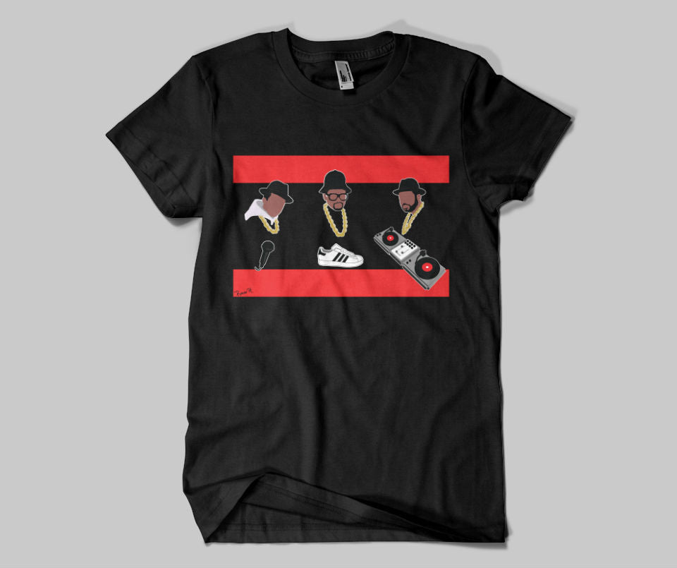
I started with RUN DMC. I wanted the iconic red bars from the logo but I didn't want to just put the words in the middle like everyone else had done. So I settled on the Mic, an shell toe Adidas, and the turntables for Jam Master J. Those dookie ropes gave me a hard time. You know how hard it is to make ink look like gold??? VERY!! I'm most proud of the way the turntables came out. I did that piece by piece and had to make it on the slant to fit it in but it's got detail and looks dope. This was also the first time I did no eyes. I don't know why I did that, but to me it looks dope. I know is creepy to some including my daughter, "dad why don't they have eyes they can't see". Meh, you will see this again in my work cuz I like it.

The next one I did was P.E., Chuck D and Flav. With this shirt I realized that I was a minimalist. What is the least amount of anything I can put on this shirt but make you know exactly what I was thinking. All outline, say word, I mean why not. The most detailed item here was the raiders logo.

Next up was the Beastie Boys. Quiet as kept of the 4 that I designed this one was my favorite and this one I put the most time into. This is where I knew I was becoming an artist and maybe a bit of a diva. I wanted people to appreciate the amount of detail I had pumped into this design. I would learn later (stay tuned below) that most folks won't be impressed, they will like it in passing but won't study it or look to deeply at it. I mean it's a t-shirt Reese get over ya self. These were my three favorite songs as well Brass Monkey, Paul Revere, and Fight for your Right to Party.
side note: Shout out to my dad, he use to drink private stock and under the cap was a picture puzzle. He would drink and give me the cap and I would try to figure out the puzzle. I thought that was the dopest thing ever, to be able to convey a message using only pictures. So this style will repeat itself time and time again in my work because I'm a fan.

Last up LL Cool J. Looking back if I'm being honest this was the weakest of the lot. However that's to be expected you do a run of shirts 1 will be the dopest and 1 will be the runt of the litter. I think the concept of the two sides to LL was dope, the playboy talking about big booties and the romantic simpin about needing love. I improved on the shimmer of a gold chain in this one though. However I know if I were to print this that shimmer might get lost in translation. Ah well, can't win em all.

Learned
Remember back up top I said I was "asked" ok well let me get into what I learned about that first. So I was asked to do this, not hired to do this, so what's the difference you ask? It's simple a hire is a contract with a deposit, an ask is a favor for the homie. The ask happened and I expected the homie to buy all four which didn't happen. I was quite pissed. However if I sit back and look at it 1) He asked for 1 shirt I turned that into 4, why would he go from $25 to $100?? I wouldn't. We discussed the 4 shirts before hand but again looking back I can see where someone would say OK but not really be to quick to take that up sale. 2) It's on me to get the money or set the price, get a deposit up front, Fat Tony taught me that, I didn't that's on me. 3) later on it was brought up that the homie didn't like all the designs. <---THIS is something that will pop up over and over and over. Just cuz I think it's dope doesn't mean others will. Do I change what I think is dope to move units?? Overall I don't , I live and die by what I think is dope, if in the end it doesn't move units then hey it is what it is (more on that in a min). I try to direct people to my website to look at my catalog of work (yeeeaaahh I'm big time now I got a catalog of work) to see if they like my style before I do work for them. I have a style and it's not for everyone, I'm comfortable saying that now, I don't think I was early on.
Even though the money up front thing was a big lesson to learn early on I must admit I still have not learned it fully (hard head make a soft ass as they use to say). I still get asked to do things and I'm not consistent in how I handle it. It's cost me money and maybe even some cool points with folks. On the other hand some folks have enjoyed the process and appreciate having their idea come to life. Yeezy shrug, meh, (I went to edit and came back to this spot and lost my train of thought...soooo fade out)

Sales
So how have the shirts done you ask?? Run DMC did very well and has done very well over time. PE sold the second best. It breaks my heart to say I've not sold not one Beastie Boy shirt!!! Like that shirt is so dope to me it makes me mad every time I think about it. Like people are you seeing all the elements on that shirt. WAKE UP PEOPLE!!! (woo saaa) This is one of many shirts I've done and been very proud only for it to go no where. LL I don't know if I even ever released it, and if I did it was a short run. I think after the Beastie Boys flopped I just gave up on this lot.
I liked this project because it challenged me to do a bunch of shirts I never would've thought to do on my own. The challenge of coming up with concepts and images that people like enough to buy is something I chase every time I design a shirt. It's often a crap shoot, I think its dope and it doesn't sell, or I think it's meh and people buy it that day. Every once in a while like Jr, I KNOW I rocked it and I get to drop the bat and slow walk as I watch it leave the yard. Overall every project is a chance to get better at my craft.


**I'm sure this blog is full of typos and what not, it's ok, it's just a blog.
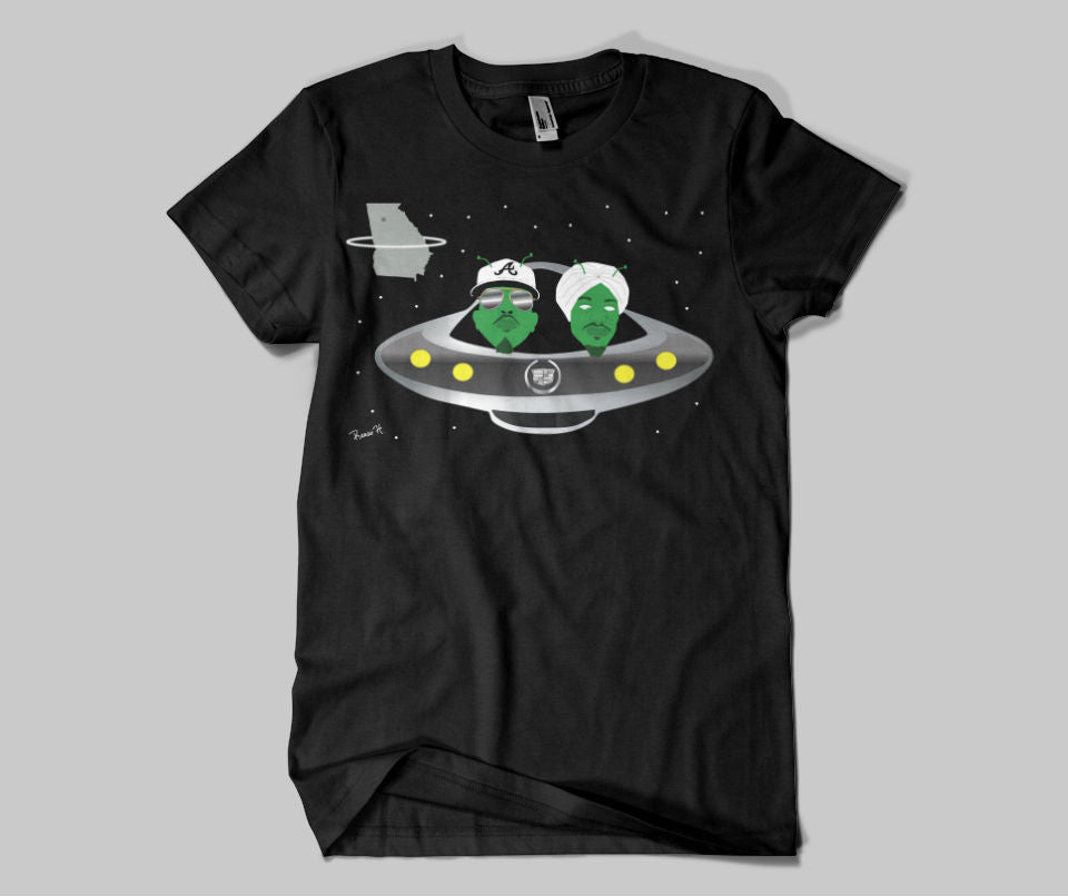
ATLiens